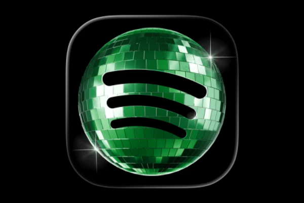
Spotify returns its app icon to the original design… disco ball design was temporary
TL;DR AI
2 min readKey summary
Spotify briefly changed its mobile app icon to a disco ball for its 20th anniversary.
Many users mistook the change for a permanent rebrand and complained on social media.
Spotify clarified it was only an event design and said the icon will revert to the original green logo this week.
The case shows how even small brand changes can quickly affect user experience and public reaction.
Same topic